

About User Preference
User Preference is an extension that enables plugin developers to provide a way for their users to customize their interface.
Plugins can use this extension by placing a button in their application that calls the API to show the user interface options modal.
Donations
You won't get any extra colors, but if it makes you feel better!-
Ko-fi: https://ko-fi.com/hizenxyz
Note: If you want this to be optional, plugins should use the EXTENSION_USER_PREFERENCE region directive. See usage example below.
Example 1 (optional dependency, recommended, using region directives):
#if EXTENSION_USER_PREFERENCE
using HizenLabs.Extensions.UserPreference.Data;
#endif
...
    void Init()
    {
#if EXTENSION_USER_PREFERENCE
        UserPreferenceData.SetDefaultTheme(this, MaterialTheme.CreateFromRgbHex("#FFFFFF", isDarkMode: true));
#endif
    }
...
    void ShowMenu(BasePlayer player)
    {
#if EXTENSION_USER_PREFERENCE

        var userPreference = UserPreferenceData.Load(_instance, player);
        var theme = userPreference.Theme;

        string primary = theme.Primary;
        string onPrimary = theme.OnPrimary;

        var userPreferenceButton = CreateButton(cui, player, userPreference,
                container: headerButtons,
                position: new(optionsButtonX - .005f, 0, closeButtonX - .005f, 1),
                offset: LuiOffset.None,
                color: primary,
                textColor: primary,
                textKey: LangKeys.StringEmpty,
                commandName: nameof(CommandMenuSettings),
                fontSize: 14
            );
#else

        string primary = "0.2 0.2 0.1 1";
        string onPrimary = "0.9 0.9 0.9 1";

#endif

        // do ui stuff, using the defined color variables
        ...
    }

#if EXTENSION_USER_PREFERENCE

    [ProtectedCommand(CommandPrefix + nameof(CommandMenuSettings))]
    private void CommandMenuSettings(BasePlayer player, string command, string[] args)
    {
        UserPreferenceUI.Show(this, player, onConfirm: () => UserInterface.ShowMenu(player));
    }

#endif
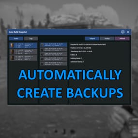
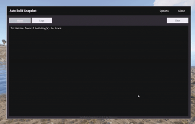
For a complete example of how far you can take this, see the AutoBuildSnapshot implementation:
https://github.com/HizenLabs/Plugins.Free/blob/main/src/Carbon.Plugins/Active/AutoBuildSnapshot/AutoBuildSnapshot.UserInterface.cs
Example 2 (optional dependency, using PluginReference):
[Info("Plugin Test", "hizenxyz", "1.0.0")]
[Description("A plugin to test things.")]
public class PluginTest : CarbonPlugin
{
    [PluginReference("UserPreferencePlugin")]
    private CarbonPlugin userPreference;

    [ChatCommand("test")]
    private void TestCommand(BasePlayer player, string command, string[] args)
    {
        if (userPreference == null)
        {
            // Show the selection UI.
            userPreference.Call("Show", this, player, () => ShowConfirm(player));
        }
    }

    private void ShowConfirm(BasePlayer player)
    {
        // Use the resulting values in the UI
        var primary = userPreference.Call<string>("GetPrimary", this, player);
        player.ChatMessage($"Primary: {primary}");

        var secondary45Percent = userPreference.Call<string>("GetSecondary", this, player, 0.45f);
        player.ChatMessage($"Secondary (45% Opacity): {secondary45Percent}");
    }
}
Example 3 (hard dependency):
UserPreferenceUI.Show(this, player, onConfirm: () => Puts("Player clicked confirm!");
Example 3 continued in theme:
var userPreference = UserPreferenceData.Load(this, player);
var theme = userPreference.Theme;

cui.v2.CreatePanel(
    container: parent,
    position: LuiPosition.MiddleCenter,
    offset: new(-450, -275, 450, 275),
    color: theme.SurfaceContainer
);

cui.v2.CreateText(
    container: parent,
    position: LuiPosition.Top,
    offset: LuiOffset.None,
    color: theme.OnBackground,
    fontSize: 16,
    text: "Welcome!",
    alignment: TextAnchor.UpperCenter
);
Themes (color palettes) are based on Material Design 3 (Material You) - https://material-foundation.github.io/material-theme-builder/
The user simply selects a color, a display mode (light/dark), and a contrast level, and a palette will be automatically generated off their selections.
The available colors for use in theme are as follows:
Primary Colors
- Primary
- OnPrimary
- PrimaryContainer
- OnPrimaryContainer
- InversePrimary
Secondary Colors
- Secondary
- OnSecondary
- SecondaryContainer
- OnSecondaryContainer
Tertiary Colors
- Tertiary
- OnTertiary
- TertiaryContainer
- OnTertiaryContainer
Error Colors
- Error
- OnError
- ErrorContainer
- OnErrorContainer
Surface & Background
- Surface
- SurfaceBright
- SurfaceContainerLowest
- SurfaceContainerLow
- SurfaceContainer
- SurfaceContainerHigh
- SurfaceContainerHighest
- SurfaceVariant
- OnSurface
- OnSurfaceVariant
- Background
- OnBackground
- InverseSurface
- InverseOnSurface
Outline & Effects
- Outline
- OutlineVariant
- SurfaceTint
- Shadow
- Scrim
- Transparent (static 0 opacity black)
You can either use these directly as properties of MaterialTheme, or all of these can be called from the plugin with userPref.Call<string>("Get[Option]") where [Option] is the color option above.
It is recommended to use them directly and just use the #if EXTENSION_USER_PREFERENCE constant to toggle functionality.